Here is a detailed analysis of the National Employment Survey 2007 from CSO, released earlier this month.
One overarching conclusion worth making is that the Public Sector in Ireland is grossly overpaid by all measurable standards before we factor in the value of their Rolls-Royce pensions.Another one is that in Ireland, it does not really pay for a person to increase their education beyond the secondary level, as all and any increases in earnings will be swallowed by taxes – even before we factor Brian Lenihan’s disastrous two budgets.Now, before I begin, some folks in economics suggest that the gap is not there, or at least that it is very small, because, as they claim, our Public Sector employs more professional grade workers... Yeah, I see. So if you chose to call your third-level educated workforce 'professionals' than you can pay them more than to their counterparts in the private sector. Common, folks, are we really saying that banks specialists are equivalent to nurses and second grade teachers? But both
are professional grades.
Another argument I've heard is that there should be adjustment for tenure of education-related returns... I do make this adjustment below, and guess what - the premium is still there.
Third argument is that workers in the public sector in general have been longer on their jobs than in the private sector. Ok, this is seriously daft - if someone has worn out more pairs of trousers sitting in one chair does it make him or her a better specialist? Surely not. Aptitude and eagerness to excel do. But there is no need for this in the public sector, for Trade Unionism philosophy is to reward better chair-sitting more than better work practices. We know this to be the case with work practices in health and education. For economists out there - here is a chance to do a natural experiment. Look at Forfas, NESC and NCC - their economics staff is older than that in many private sector outfits. And they produce spectacularly bad research. Get my point? Or the CB?
Fourth, there are people out there who argue that higher pay is justified by greater complexity of work performed. Yes, indeed - filling paperwork and filing it from one end of the desk to another is certainly hard. Get real - Ireland is a small, geopolitically insignificant country on a margin of a largely internationally inert region. Does our Department of Foreign Affairs compare to the US State Department? Does our CB compare to the ECB? Does our CSO compare to the Eurostat? Does our department of Finance compare to the US Treasury? And yet - they are all paid more in Ireland than in these other countries.
Regressions, my eye. There is, somewhere behind this screen smoke of academic economics, an intuitive ability to comprehend simple facts without regressing them to death. I hope.
Let us start with the distribution of earnings by sector:

Evidently, both Public Admin and Defence, and Education have much heavier segment of earnings falling at or above €30 per hour than in the overall economy. This, undoubtedly, is because our secondary and primary teachers and bureaucrats are so significantly more skilled and more productive than the rest of this economy.

Now, the chart above shows mean earnings by sector. Guess who’s consistently above the economy total lines? Yeah, Electricity, Gas and Water Supply sector composed largely of Public Sector employees, Civil Service & Defence, Health and Education. Notice that the gap between part time (non-unionised) and full-time (unionised) labour pay in Education is beyond any comparison with other sectors. Is this a sign of the trade unions-led exploitation of part-time workers? Surely, was this the case in, say Financial Services, ICTU/SIPTU gang would have claimed this to be the case of part-time workers being underpaid.
Oh, and ditto for the median earnings as well:

And just to highlight that exploitation question a bit more:

Now, is there any correlation between our secondary and primary teachers being over-represented in the Dail and the pay outcome for the Education sector? I am not sure… may be that great state-owned think-tank of ours, ESRI/Forfas/NCC/NESC can ask this question? Neah, unlikely…

Well, above shows even more conclusively that our Public Sector employees are living good lives: males and female alike. Ditto in terms of median earnings:

In fact, the frightening overpay – by age comparisons and gender comparisons – in the public sector relative to the private sector should warrant an introduction of a new statistical measure. As opposed to the ‘median’ earnings in the private sector, we should report the ‘comedian’ earnings in the public sector, so farcical are these differences. Oh, and notice how median earnings in the public sector rise before the retirement? Well, of course, this the ‘Golden Handshake’ bonus – when management gives workers and itself a final raise in late employment to lock in higher pensions. Regardless of their efforts, abilities, productivity etc. Just to be sure that the private sector taxpayers really pay for the Trade Unionist policies on public sector pensions through the nose.
So what about the total tenure on the job, you’ would ask? Ok, here it is:

Same picture here too – overpaid public sector for any level of tenure. And ditto for the median earnings:

An interesting look at the labour force vintage:

Notice that male/female differential? Pretty strong and it does not get much lower for higher education levels, which means that the previously mentioned wages gender gap evening out in higher education levels cannot be explained by greater labour force participation by women with higher education. The Public Sector overpay for education might be a real reason, then.
Oh, want to see the real reflection of unemployment risk in the private sector? Here it is:

Notice how years in employment I public sector exceed those in private sector? Oh yes, that’s because in public sector there is no unemployment, folks. It is also because some work practices in the public sector allow temporary exits from work without disrupting tenure (continued education and family care are two examples), while they do so in the private sector.

For the previous chart: we combine hourly earnings, plus bonuses and BIK. No evidence of public sector bonuses being any lower than private sector one. And of course our ESB-led energy sector is rolling in cash, because, as you would have expected, without them, the country would be plunged into a new ice age.
On to the ‘knowledge’ economy reality:
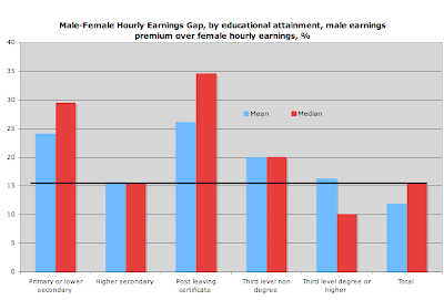
Since this is the gender gap, it captures in part the educational premia un-adjusted for tenure (with women having traditionally lower tenure than men across the labour force). In other words, it does reflect the mixed benefit of longer tenure at each educational level. Notice the decline in the Mean/Median premia with higher levels of education attained. So far, the chart really suggests that Post-Leaving Cert is associated with the highest gender gap. This is good news, as it suggests that the more educated the person is, the lower is the earnings gap. But what it also tell us is that at higher education levels, either women tenure is getting closer and closer to men, or we are not pricing fully the differences between men and women in terms of labour supply. Other explanations can contribute to this trend, including:
- It is possible that at higher levels of education productivity of workers increases in time into later years, when both men and women tend to supply very similar work hours (not the case per below);
- It is possible that a single large sector drives the right-tail differentials in wages down artificially (which is indeed is the case with the higher education attainment in Public Sector employment as we shall see).
Either way, this is a largely un-researched area…
Now, returns to education:


Self-explanatory, really... not much to add other than clearly, something is not working here in the land of our 'knowledge' economics. I'll tell you what:
- High returns to tenure - courtesy of the Trade Unions we have extremely high returns to tenure, so that the older workers receive the benefits of higher productivity brought on-board by the younger workers' educational attainment and aptitude;
- High taxes - upper marginal tax rate of more than 50% today is wiping out the benefits of additional education.
This is why, incidentally, I do not swallow this idea of a Swedish-styled 'knowledge'-intensive labour markets. Anyone with real knowledge would be better off working somewhere else, rather than Ireland.
Next, consider median hourly earnings by nationality. Clearly, Accession EU12 and Other nationalities stand out from the EU15 citizens in terms of achieving much lower wages for males (female wages are substantially lower for the Accession 12 nationals) and by an out-of-line gender wage gaps. Irish wages are the highest across all nationalities, which, given the fact that both the UK and EU15 migrants have higher educational attainment on average than their Irish counterparts also illustrates the fact that it is tenure that determines Irish wages, rather than other characteristics of the workers.


Chart above further breaks down the labour market returns by nationalities and sectors. Foreigners work longer hours and earn less in wages than the Irish workers in every sector. Exceptions are:
- Public Admin & Defence, where foreigners do earn less and work slightly lower hours, reflective of their predominantly part-time work basis and the cynical unions policies that protect Irish workers while allowing for no protection for many foreign ones;
- Ditto Education, where as we all know well, even at a third level, there are barriers to promotion and pay amongst foreign researchers and lecturers.

So now on to the returns to education again. The chart above shows education premium ratio to tenure premium for two upper categories of educational attainment. Of course, the CSO cannot be bothered to separate 3rd level degree holders with those who have higher educational attainment. But the picture is already relatively compelling.
Because of restricted hiring (the younger workers are first to be fired due to lower cost of doing so), promotion (tenure considerations in wage increases and promotion awards) and pay conditions (pay and benefits linked to tenure), life-time education premium is abysmally low (or even negative) for males in all age groups. This can be, possibly, interpreted as returns to on-the-job training, but the severity of tenure premium over education premium makes it doubtful that this is indeed a factor that fully accounts for such differentials.
Note an interesting feature that shows females as being significant gainers from education? Well, this is because, as I’ve shown earlier, the public sector employment premium is so vastly greater for females. In other words, the female return is severely skewed by the public sector employment conditions.

Ditto for tax-adjusted real returns net of costs of investing in education.
So few last slides then:

Back to the public/private sectors gap, take €30 per hour in earnings and look at the share of employees earning in excess of that by sector. Hmmm... this was before massive cuts in earnings in the Financial Intermediation and unadjusted for the risk of ending up without a job. Of course, note the Health sector, where lower paid (often) foreign workers are outweighing consultants and managers...
Next, comparatives for mean and median full-time earnings:

Here, let us benchmark against the Public Admin and Defence. Pretty good stuff for the bureaucrats, who earn third highest median wages in the sample for males and second highest for females and in the overall total count. Apparently, they
are better than the bankers and finance professionals... if only someone can tell me in what.
And another look at the same thing, from a different angle:

Ok, enough - there are only so many ways one can look at the same data set, so here is the last one - a look at the education premium...

Obviously, once you have a luxury of tenure, go study... but before then?..


 Evidently, both Public Admin and Defence, and Education have much heavier segment of earnings falling at or above €30 per hour than in the overall economy. This, undoubtedly, is because our secondary and primary teachers and bureaucrats are so significantly more skilled and more productive than the rest of this economy.
 Now, the chart above shows mean earnings by sector. Guess who’s consistently above the economy total lines? Yeah, Electricity, Gas and Water Supply sector composed largely of Public Sector employees, Civil Service & Defence, Health and Education. Notice that the gap between part time (non-unionised) and full-time (unionised) labour pay in Education is beyond any comparison with other sectors. Is this a sign of the trade unions-led exploitation of part-time workers? Surely, was this the case in, say Financial Services, ICTU/SIPTU gang would have claimed this to be the case of part-time workers being underpaid.
 And just to highlight that exploitation question a bit more:
 Now, is there any correlation between our secondary and primary teachers being over-represented in the Dail and the pay outcome for the Education sector? I am not sure… may be that great state-owned think-tank of ours, ESRI/Forfas/NCC/NESC can ask this question? Neah, unlikely…
 Well, above shows even more conclusively that our Public Sector employees are living good lives: males and female alike. Ditto in terms of median earnings:
 In fact, the frightening overpay – by age comparisons and gender comparisons – in the public sector relative to the private sector should warrant an introduction of a new statistical measure. As opposed to the ‘median’ earnings in the private sector, we should report the ‘comedian’ earnings in the public sector, so farcical are these differences. Oh, and notice how median earnings in the public sector rise before the retirement? Well, of course, this the ‘Golden Handshake’ bonus – when management gives workers and itself a final raise in late employment to lock in higher pensions. Regardless of their efforts, abilities, productivity etc. Just to be sure that the private sector taxpayers really pay for the Trade Unionist policies on public sector pensions through the nose.
 Same picture here too – overpaid public sector for any level of tenure. And ditto for the median earnings:
 Notice that male/female differential? Pretty strong and it does not get much lower for higher education levels, which means that the previously mentioned wages gender gap evening out in higher education levels cannot be explained by greater labour force participation by women with higher education. The Public Sector overpay for education might be a real reason, then.
 Notice how years in employment I public sector exceed those in private sector? Oh yes, that’s because in public sector there is no unemployment, folks. It is also because some work practices in the public sector allow temporary exits from work without disrupting tenure (continued education and family care are two examples), while they do so in the private sector.
 For the previous chart: we combine hourly earnings, plus bonuses and BIK. No evidence of public sector bonuses being any lower than private sector one. And of course our ESB-led energy sector is rolling in cash, because, as you would have expected, without them, the country would be plunged into a new ice age.
 Since this is the gender gap, it captures in part the educational premia un-adjusted for tenure (with women having traditionally lower tenure than men across the labour force). In other words, it does reflect the mixed benefit of longer tenure at each educational level. Notice the decline in the Mean/Median premia with higher levels of education attained. So far, the chart really suggests that Post-Leaving Cert is associated with the highest gender gap. This is good news, as it suggests that the more educated the person is, the lower is the earnings gap. But what it also tell us is that at higher education levels, either women tenure is getting closer and closer to men, or we are not pricing fully the differences between men and women in terms of labour supply. Other explanations can contribute to this trend, including:
 Self-explanatory, really... not much to add other than clearly, something is not working here in the land of our 'knowledge' economics. I'll tell you what:
 Chart above further breaks down the labour market returns by nationalities and sectors. Foreigners work longer hours and earn less in wages than the Irish workers in every sector. Exceptions are:
 So now on to the returns to education again. The chart above shows education premium ratio to tenure premium for two upper categories of educational attainment. Of course, the CSO cannot be bothered to separate 3rd level degree holders with those who have higher educational attainment. But the picture is already relatively compelling.
 Ditto for tax-adjusted real returns net of costs of investing in education.
 Back to the public/private sectors gap, take €30 per hour in earnings and look at the share of employees earning in excess of that by sector. Hmmm... this was before massive cuts in earnings in the Financial Intermediation and unadjusted for the risk of ending up without a job. Of course, note the Health sector, where lower paid (often) foreign workers are outweighing consultants and managers...
 Here, let us benchmark against the Public Admin and Defence. Pretty good stuff for the bureaucrats, who earn third highest median wages in the sample for males and second highest for females and in the overall total count. Apparently, they are better than the bankers and finance professionals... if only someone can tell me in what.
 Obviously, once you have a luxury of tenure, go study... but before then?..
 Section 1: Successful Transition
 No explanation as to what 'income per capita' does DofF have in mind, although it is fairly clear it is GDP per capita, not GNP per capita - a difference of roughly 18% to our real income... Another fallacy is to compare ourselves to the EU15 (note to the slide contains explanation that it is EU15 indeed) (presumably) average income per capita. Why? Why not the US?
 Yes, this is all true. But we are comparing to 2009, so why not take 1999 as a mark for comparison? And what does this mean? That we used to be an even worse basket case than we are today, so let's live off our achievements of the past? Or that we should be grateful to out civil service masters for the blessing of not living in 1987 anymore?
 Sorry, but why are we using 2007 as a benchmark? If you and I were still living in 2007, would DofF need to produce this presentation? I don't think so. So why not be honest and produce a 2009 economic conditions slide instead of 2007?
 I do some of the analysis of this slide and what it means for the future growth potential in Ireland in the next week's Business & Finance magazine.
 Notice that there is no bullet point for:
 It is not explained in the above slide, but HCI stands for Harmonised Competitiveness Index. Per latest data available, chart below plots actual HCI numbers from the Central Bank site (here)
 Two things are worth noting above, that are not mentioned in the DofF presentation. DofF data is heavily smoothed, implying that one cannot tell much from their chart about more recent changes in HCI. Second, instead of improving competitiveness in the downturn, as all real economies do, Ireland is actually experiencing further deterioration in competitiveness since the beginning of 2008! Clearly this shows that Irish Government policies aimed at improving competitiveness - the favorite buzzword of Mary Coughlan and the rest of the economic illiterates occupying highly paid ministerial seats in this country - are not working!


 The claim is that if we are falling in unit labour costs by 7%, we are showing improving competitiveness and evidencing Irish economy's superior flexibility. This is simply idiotically simplistic interpretation of the data. First, it is important to understand that our unit labour costs are falling from already sky-high base, so a 7% fall does very little to bring us in line with EU unit labour costs. Second, this data refers primarilly to manufacturing, while over 70% of our economy is in services. Third, this data is based on GDP measure of output, which, as mentioned earlier, is a completely irrelevant measure for overall output of an economy built on tax arbitrage.

 I am commenting on the above slide's ludicrous assertion concerning rapidly adjusting public sector wages in my article in Business & Finance. Needless to say - this is simply referring to a 7.5% pensions levy, which I do not consider a wage cut, but a delayed payment for pensions benefits. In fact, the payment is still only partial.
 What does 'Credit Package' mean above? And on the €376bn in guarantees - this excludes €90bn guarantees under Deposit Protection Scheme that covers deposits up to €100K. Bank recapitalization also fails to mention the special deposits placed with Anglo by the state to prop-up, artificially, bank's balance sheet.
 The last point is a real nuke here - in effect, DofF has pre-committed in May 2009 - before any public recognition of this commitment by any politician in the country - to extend banks guarantees for long-term debt, thus saddling our children's generation with an open-ended insurance bill for future bank failures and giving banks a blank cheque to write their future borrowings on. I do not know about you, but bureaucrats acting like tzars with taxpayers money is what happens in totalitarian societies, not in parliamentary democracies. The slide also does not mention future recapitalisation rounds, covering the latest demands from Anglo and expected future demands from NAMA-participating banks.
 This slide is beyond any level of rationality. To call the deepest collapse in public finances in Europe as 'difficulties but starting point is favourable' is simply an understatement that betrays either the lack of honesty on behalf of the DofF or their complete detachment from the real world. Take your pick.
 I show conclusively in my Business & Finance article that fiscal conslidation claimed by DofF to have covered 5% of GDP is barely stretching to 2% of GDP. I would also suggest that we should stop the farce of identifying as 'spending cuts' reductions in planned, but not disbursed spending. It is also worth noting that all of the above measures on taxation and spending cuts have been shown to yield expected savings or revenue increases well below those claimed in the slide.
 I don't really want to comment on these figures again, as I have done so following the Supplementary Budget - from which these figures were simply cut and pasted into this presentation.
 So 'responses' are:
 No Comment...